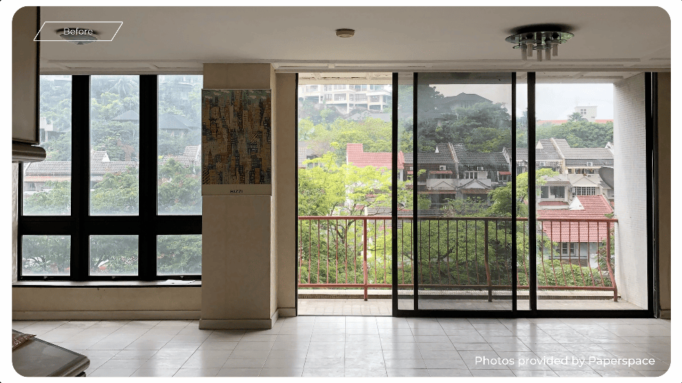
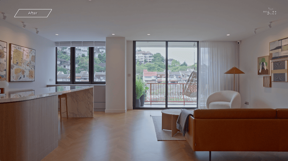
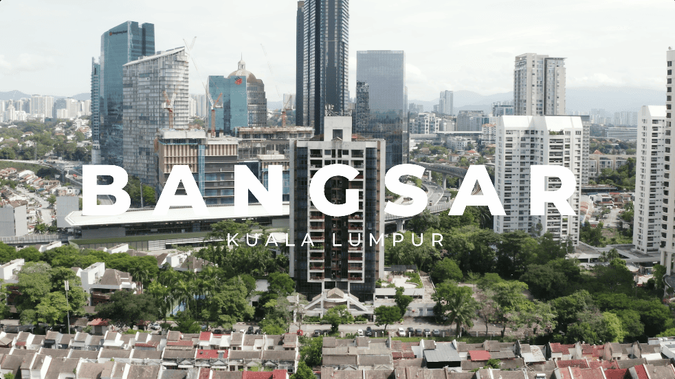
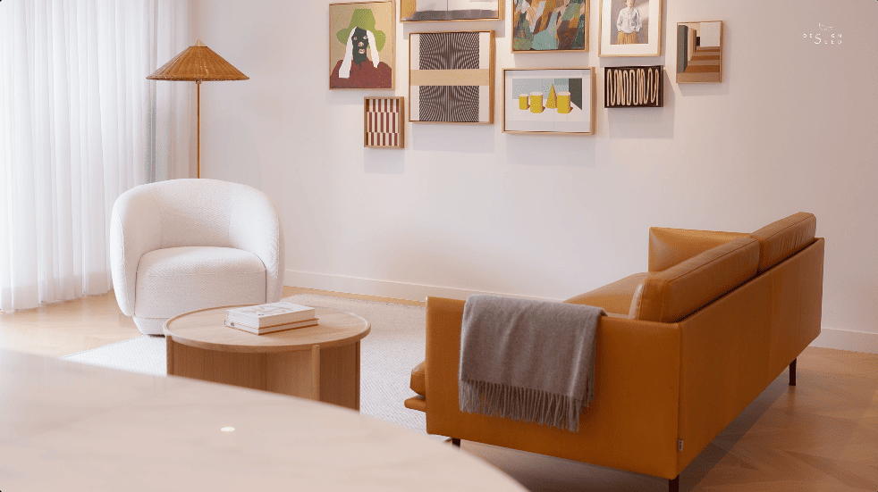
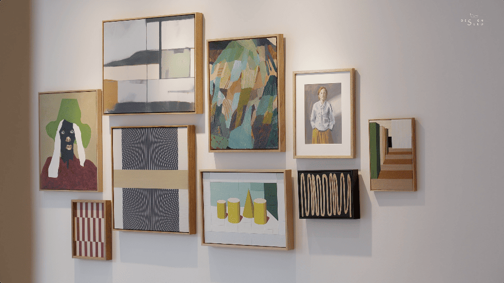
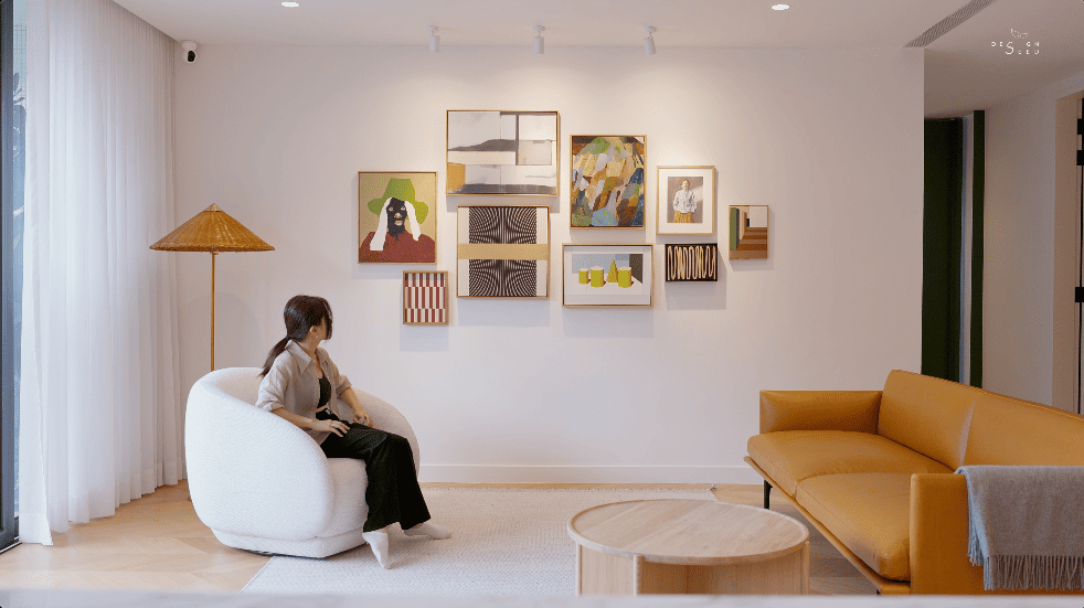
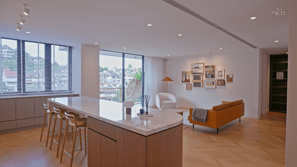
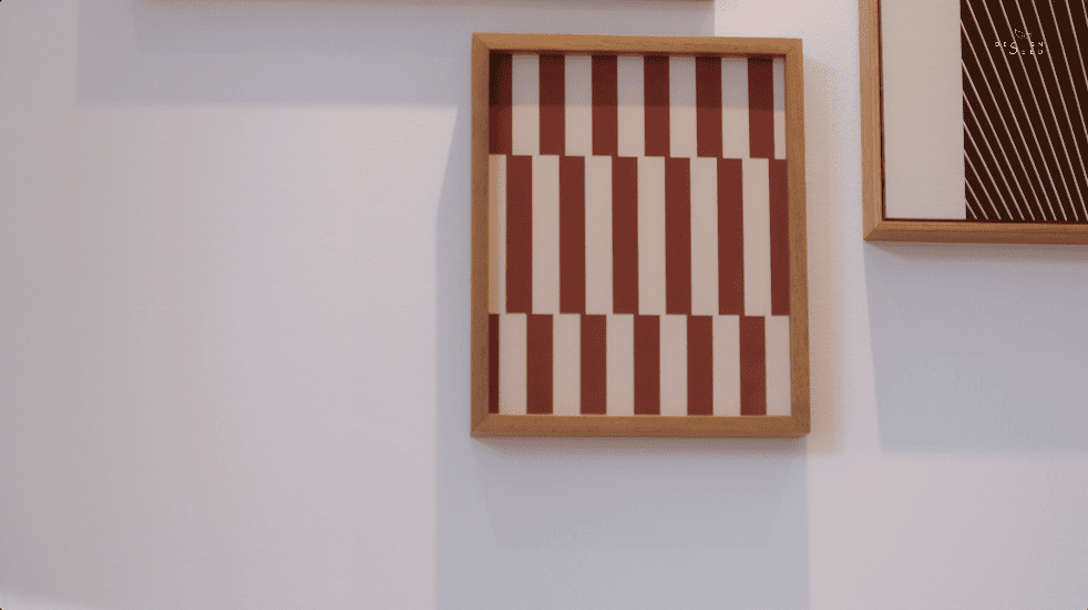
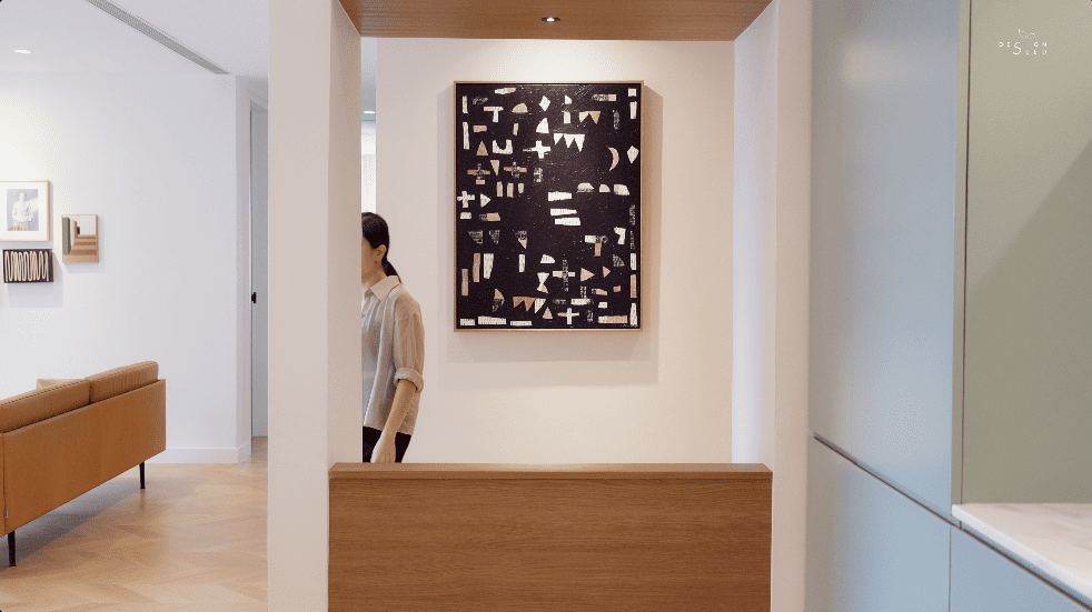
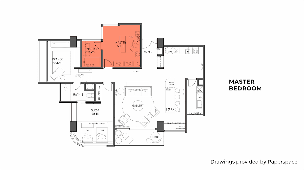
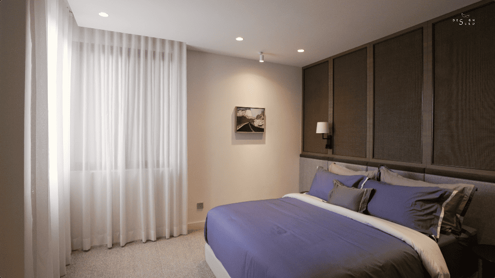
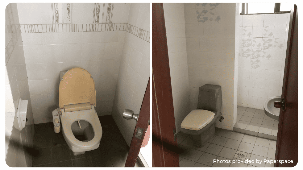
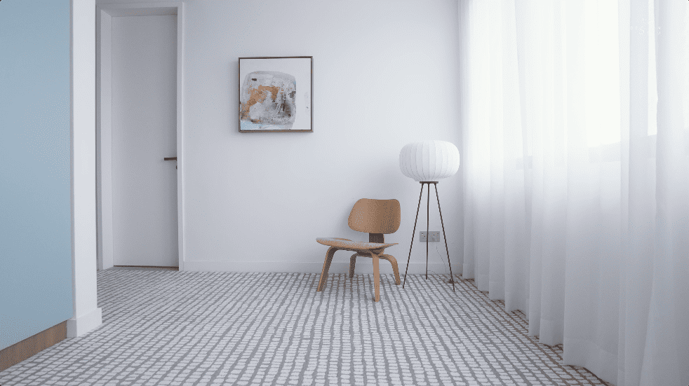
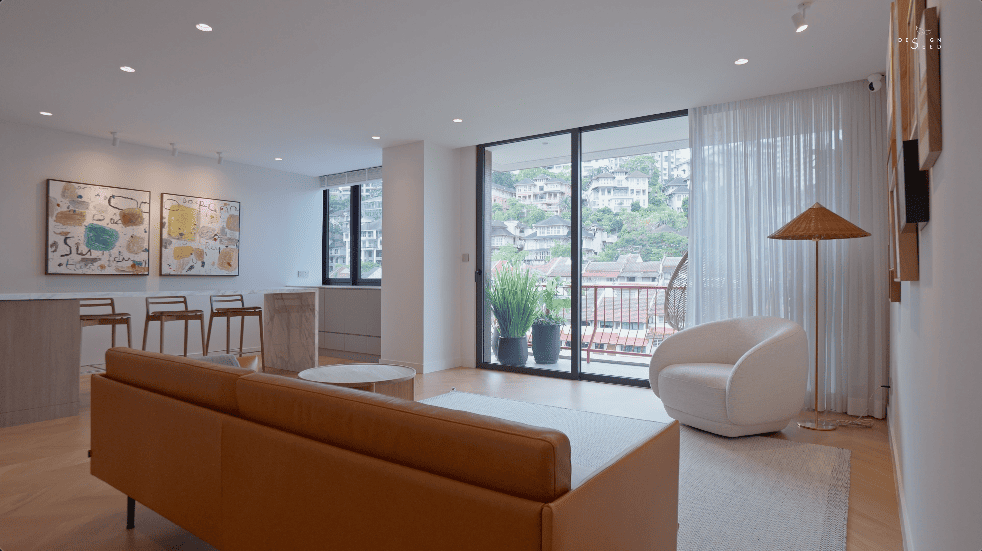
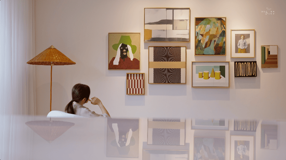
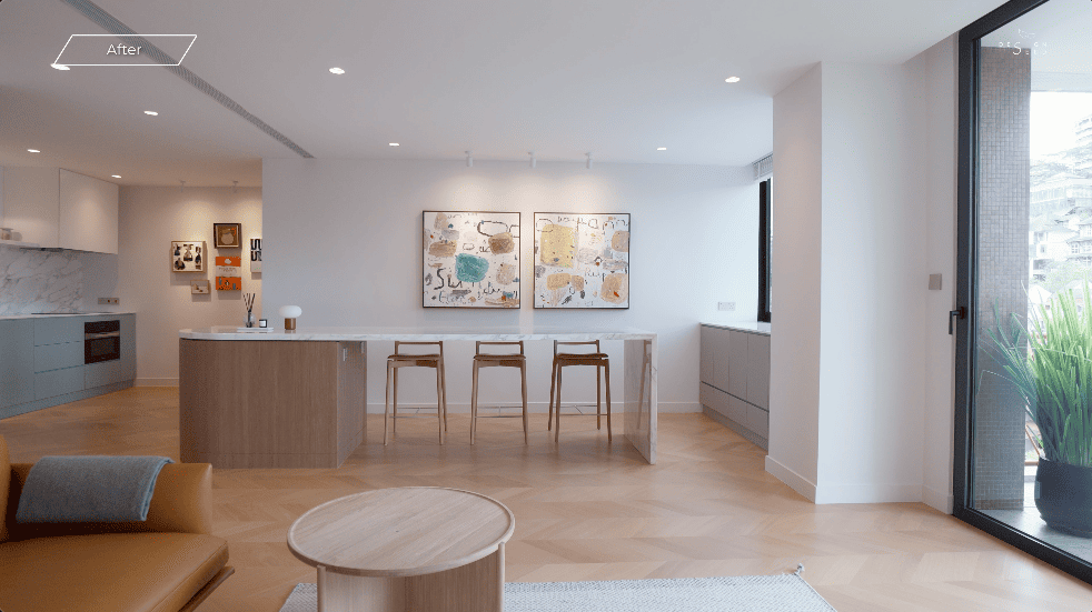
Small Space, Big Impact | Hidden Sanctuary Revealed | House Transformation | Interior Design
5 min read
You know that feeling when you step into an old building and immediately get transported back in time? These older condominiums have their own charm, filled with nostalgia. But what if I told you, hidden behind one of these unassuming doors is a comforting, modern sanctuary you’d never expect?
The architect behind this transformation is Winston from Paperspace, who was featured last year in our Kami House episode. This time, he takes us on a trip through nostalgia and comfort, transforming an old home to this.
This is among the oldest condominiums in Bangsar, completed in 1987. Standing at the test of time, the residence exudes a nostalgia appeal. As the door swings open, the contrast is striking. Gone are the old school corridors, replaced by a space with beauty in almost every turn. The first thing you notice is the sense of calm.
“The size of the property is about 1,400 square feet, and it’s a very standard two bedroom apartment in KL. But what’s unique about it, it’s at least 30 to 40 years old. It’s one of the very first OG apartment in Bangsar,” explains Winston from Paperspace.
“We call it “Bisu”. Basically, it means mute in Malay, but mainly because we wanted this place to be a place of silence for the client. Well, the artwork is the main criteria. So we wanted this apartment to be sort of like an art gallery for her to showcase her artwork.”
With a space designed for conversation and art, the artistic feature wall is the highlight here. When designing a space around an art wall, it’s important to let the artwork take center stage while ensuring the overall composition feels balanced and intentional.
Start by selecting a focal piece or curating a collection of artworks that complement each other in theme, color, or style. Keep the surrounding design elements subtle and cohesive to enhance the visual impact.
“I think the living room generally has been maintained the same way, but what we have changed is basically, the way we treat the walls, the way we treat the floor and ceiling. Everything was just kept to very clean, very white, very sterile, and we just let the artwork speaks for itself, ” Winston explained.
“The inspiration that comes from the artwork, you can see there are little hints of the textures where they play with smaller strokes again. I think we bring that motif to the balcony. And then at the same time, because the existing building has this little small mosaics, and we wanted the connection to the old and new.”
“So example of what I wanted to say is, like this pattern, it’s staggered. It inspires the carpet design as well where the mosaic staggers. The first picture that actually she showed me was the teapot in the kitchen. And that green, actually, we use the same palette for the kitchen cabinets.”
“So the kitchen originally was a closed kitchen, but being tucked to the end of the apartment, it just feels really abandoned. So by opening everything up, we actually added a dedicated foyer area, and then how the foyer actually has this structure and then you actually see your open kitchen.”
With the bench subtly designed to be part of the carpentry work, this becomes an extra space to put on your shoes. This simple yet effective design also frames the painting, allowing it to be viewed properly.
Many homes hang paintings in narrow hallways. But in fact, that is a big no. Narrow hallways can easily feel cramped and adding paintings can make the space feel even smaller and congested.
“So for the master bedroom, we wanted really like a hotel suite feel where it’s really calm, but we also wanted a twist of Malaysian as well. So we introduced a bit of rattan in there. So, generally it’s no fuss because the rooms are quite small, so we just create a feature wall that is also acting like a headboard as well.”
“So the problem with the previous apartment is, every time you open a door, you’re always opening towards the toilet bowl. So in this case, we try to, you know, create a discipline where when we come in, you’re always greeted with a proper sink area, proper vanity. So everything just looks a bit more inviting.”
A well-designed bathroom should feel spacious and functional, but poor door placement can make even the largest spaces feel cramped. By reconfiguring the door placement, this simple yet impactful change eliminates awkward obstructions. As a result, the bathroom feels more open and easily accommodates a bathtub.
Designing a kids’ bedroom in a small space is all about finding the perfect balance between function, creativity, and comfort. With limited storage space, every design choice needed to be served a purpose while keeping the room inviting. Here, the basin has been moved out of the bathroom. This change not only saves space but also becomes a feature for the room.
“As for the kids’ room, we just created a platform bed just to make it a bit more fun for them. She has two boys, so it’s always like a little demarcated area where that’s a sleep area, and then the carpeted floor is always the play area. And then we bring back the motif of the mosaics as well and from the artwork as you can see, into the bedroom carpet design.”
“We wanted to create sort of a playful, but yet mature at the same time, sort of a blue motif bathroom.”
At the end of the hallway, a striking green bookshelf is a bold design feature. But there’s more to it than meets the eye. With one push, a hidden room is revealed.
“It’s always not nice to see a lot of doors, especially when the bedrooms are all clumped together. So for me, a hidden door is a good solution to sort of conceal the entranceway, but at the same time to diffuse the energy going into it. At the same time, it becomes like another opportunity for her to display her travels or experiences as well.”
“During my very first few encounters with the client, she pulled out sort of like an entire bag of mood board, but it’s not exactly the mood that she wants, but mainly on the furnitures that she has really strong interest in. Some but like this chair. So it’s a little bits of pieces, that inspires the whole interior design.”
“So it’s kinda like working backwards. You know, you start with a finishing touch, and then you sort of form the beginning. So it’s quite fun in that way. It’s very very different from conventional but, yeah it’s a very interesting process.”
“For me, this house is always it’s all about second chance. Well, her being giving a second chance to this apartment, being so old, she’s willing to take the risk and give a second life. And how the apartment is giving back her second chance at finding joy.”
It’s a comforting space that feels effortlessly put together. Every detail, from the textures to the furnitures, works in harmony.